Glow Beauty
How streamlining the skincare product comparison process can increase conversion rate.
PROJECT TYPE
Conceptual
PROJECT DATE
Jan - Mar 2023 (3 months)
MY ROLE
Solo Product Designer
TLDR
ABOUT GLOW BEAUTY
Focus on helping you achieve your best glow by providing products to enhance the natural radiance and beauty of you. With many skincare products out there, Glow Beauty aims to simply the experience of picking the right product for your skin needs.
HYPOTHESIS
Users struggle to identify the best skin care product based on its features in comparison to others.
BUSINESS GOALS
Improve conversion from browsing to completion of the checkout to increase revenue on the product’s mobile-web experience
Reduce cart abandonment at the registration page by implementing a guest checkout option that captures email
SOLUTION
From extensive secondary research and analysis of direct and indirect competitors in the market, these are my proposed solutions to address business goals and user needs. I wanted to create a transparent, engaging, and convenient experience for our users.
THE PROBLEM
Glow Beauty faced obstacles in converting their website visitors into satisfied customers.
Examining Glow Beauty’s current customer journey based on the information provided by the Project Manager, we see that the number of website visitors gradually declines as they progress through the mobile-web journey.
COMPETITOR ANALYSIS
In search of effective strategies to achieve our business goals, I conducted a thorough analysis of three industry leaders.
Although there were some variations among competitors, upon careful observation, it became apparent that the overall approach was quite similar.
Going through each one of their mobile-web shopping experience and looking at product pages I noted down likes, dislikes, and action items and concluded that I should be incorporating into my design.
PRIMARY RESEARCH
By analyzing user behavior and feedback, I have identified key areas where improvements are needed to enhance the checkout process and increase conversion rates.
While studying best practices from industry leaders in the beauty space, I recognized the need to delve deeper into understanding user shopping behaviors and needs, as well as validating our hypothesis. To achieve this, I conducted interviews with 5 frequent skin care shoppers who regularly use their mobile devices for shopping, making purchases for themselves at least every few months.
From research, four main insights were discovered.
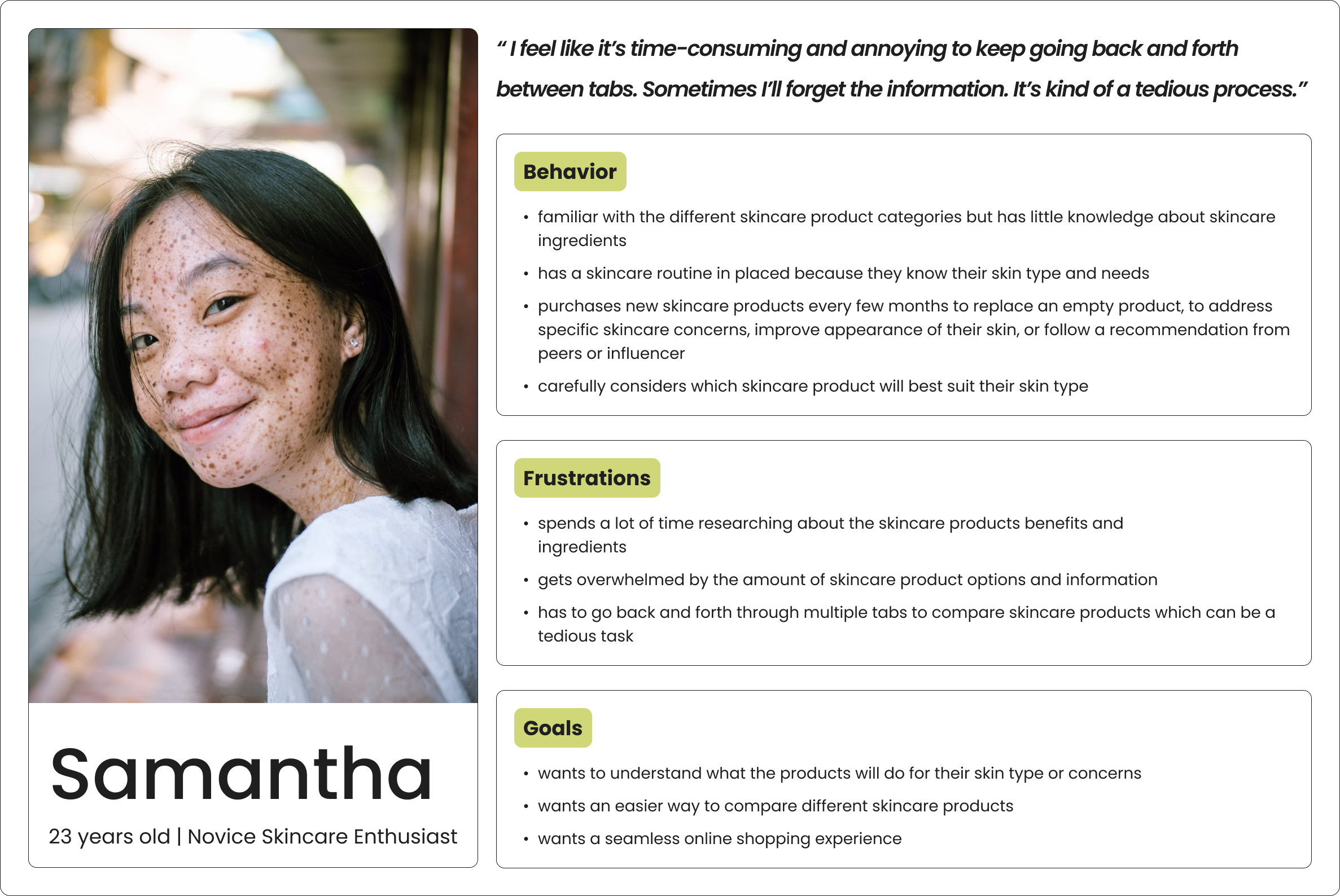
DESIGNING FOR A NOVICE SKINCARE ENTHUSIAST
We’re designing for Samantha.
The user interviews provided valuable insights into the participants' skincare knowledge and preferences, which helped shape the development of our targeted user persona.
Samantha’s main job is to purchase skincare products.
To keep my focus on the underlying goals and tasks users are trying to address I used the Jobs To Be Done framework.
THE CHALLENGE + IDEATION
The original approach to generating innovative ideas was not as successful.
Initially, I planned to use the method of analyzing direct and indirect competitors for inspiration. But I found it ineffective to generate innovative ideas based on existing market offerings. Scrapping the approach, I shifted my focus to market research to identify the gap and analyzing user shopping behaviors to guide my design direction.
Previous approach of brainstorming ideas with hand sketchesHow might we help users easily understand product benefits and functions so that it’s less of a tedious, difficult, and time-consuming task?
“I am doing research, I am comprehending it myself, and that is a lot of work but if a site can give me comprehensive information together I feel like that’s going to relieve some stress.”
- Interviewee 5
To address this, I suggest optimizing the product page experience as it is the most critical part of any store. I narrowed my focus to the reviews and ratings section of the product page, as this is where users tend to look for information to help with purchase decisions.
How might we simplify the product comparison process for users so that they can view multiple products side-by-side?
Users tend to keep multiple tabs open or add items to their cart to compare products. Comparison websites and Excel sheets are often used to organize and compare product information. Given this behavior, I researched how companies with comparison tools operate in order to identify any gaps in the market with the current existing tool.
From my observation, most comparison charts looked the same with static data about the product, a list of features, and details about each product's features. And, that is how the idea of an interactive comparison chart emerged.
With feedback from my mentor, we recognized the potential to push the boundaries of the interactive comparison chart solution, aiming for an even more innovative and impactful design. I went back to the drawing board.
“…an interactive comparison chart can help you rank on page 1 of Google, increase site traffic by 28% and bump revenue up by 37%”
- Visme
Interactive content tends to captivate users, increasing engagement and conversion rates. Armed with this valuable information, I set out to explore methods to create a more engaging and effective comparison chart.
How might we design a seamless online guest checkout option for users so that they can purchase their skincare products quickly?
When searching for the right skincare product, users often take their time in making a decision but ultimately want a quick checkout process. With insights from Shopify, Baymard Institute, and Clutch.co, I have worked on decreasing the time spent on this process.
INFORMATION ARCHITECTURE
Get in loser, we’re going shopping.
Three user stories were developed based on the solutions to show how users will interact with the platform. To create user-friendly experiences, I incorporated familiar patterns from e-commerce websites in my user flows.
Flow 1: View Pros and Con summary on product page
Flow 2: Select products and compare them
Flow 3: Checkout as a guest
DESIGN DEVELOPMENT
Putting pen to paper first.
To determine what to wireframe and prototype, I sketched out the screens on my iPad using the mockup app. This will serve as my reference as I move along the project.
Pros and Cons Summary Select 5 Products to Compare Comparing Products Checking OutAfter completing my screen sketches, I began to contemplate my design choices and felt the need to confirm some uncertainties through user testing.
I quickly recruited 5 friends and family who regularly purchase skincare products online for themselves through their mobile devices every few months. The goal was to gather feedback on the design solutions and validate my hypothesis.
STYLE GUIDE
Creating a brand identity and style guide to bring the product to life.
In order to accurately test for any issues and assess micro-interactions that could not be tested through low-fi sketches, it was necessary to create a HiFi prototype that closely resembled the final product.
TESTING & ITERATING
One round of testing high-fidelity prototype with 5 participants.
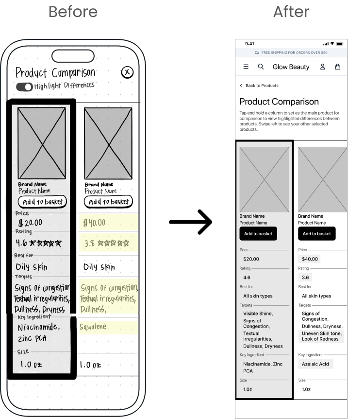
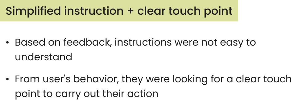
After testing my high-fidelity prototype, I received valuable feedback on micro-interactions, and element placement, and validate a hypothesis on whether a horizontal or vertical comparison chart would be better to view products side-by-side.
Key improvements from testing:
HERE IS WHAT YOU’VE BEEN WAITING FOR
Final Screens
IMPACT
“I think it was pretty fun to interact with. It’s very neat. I just feel like all the information was presented in a way that’s absorbable for comparison side by side.”
- Participant 3 (Intermediate Skincare Enthusiast)
Overall, the products received great ratings from the participants in terms of how probable they would use them in real-life scenarios. The ratings ranged from 1 to 10, with 10 being the most probable and helpful, and 1 the least probable and helpful.
ENDING REFLECTIONS
Main challenges were…
Developing innovative ideas that stood out in the market to solve our user’s needs. However, conducting a competitor analysis helped me identify the gap between my competitors and my client. Also, from exploring other industries’ approaches I was about to identify areas where improvements can be made to enhance the existing market offering.
I learned that…
Sketching limitations in wireframing. Sketching to determine the placement of elements may not be the most effective approach. Transitioning from sketches to mid-fi wireframes can lead to changes in the size and layout of elements, requiring adjustments thus impacting user feedback.
Prioritize progress by focusing on essentials. Importance of focusing on delivering what is needed for me to move forward with the project, even if it means simplifying the process and setting aside non-essential wishlist items for later improvements. Powering through challenges and prioritizing requirements was crucial for ensuring I could achieve our goals.
If I had more time…
Further develop pros and cons summary. I would further explore integrating a pros and cons summary section on the product page. This would give users a concise and transparent overview of the product's benefits and drawbacks.
Skincare input to help with product compatibility. I want to expand the idea of allowing users to input their skincare routine. This feature would enable them to identify areas where they could replace products with alternatives, ensuring compatibility with their existing regimen. This would allow users to try new products while maintaining a consistent routine.
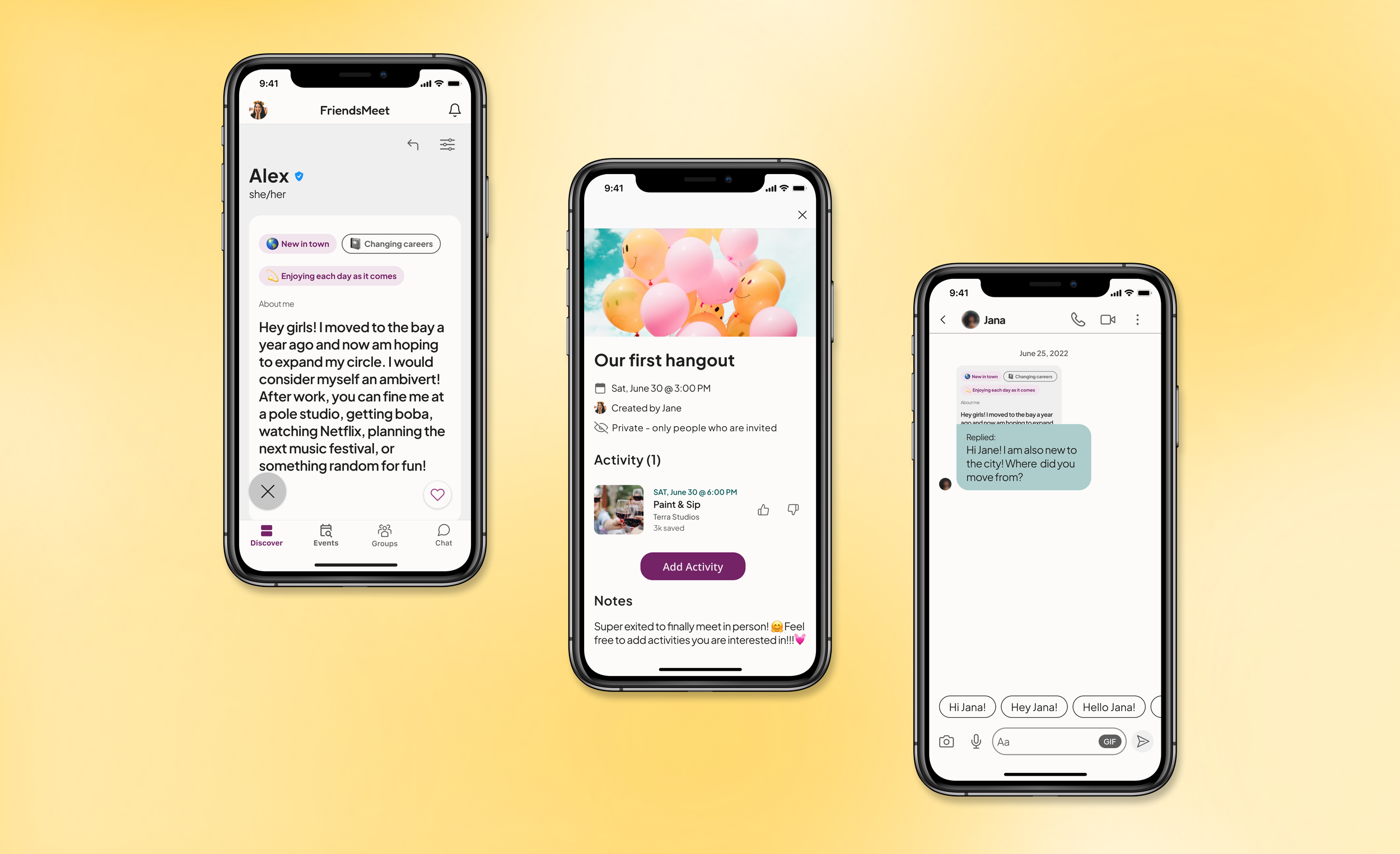
More Case Studies
Redesigning the way people forge online connections to turn into meaningful in-person meetups.
Improving InvestorMatch.ai onboarding process and I helped increase the user completion rate.


