InvestorMatch.ai
Improving InvestorMatch.ai onboarding process and I helped increase the user completion rate.
PROJECT TYPE
SaaS
PROJECT DATE
March - April 2023
MY ROLE/RESPONSIBILTIES
Lead UX/UI Designer
Interaction Design
Prototyping
Research Usability Testing
Visual Design
TLDR
ABOUT INVESTORMATCH.AI
InvestorMatch.ai aims to bridge the gap between investors and founders by eliminating the obstacles caused by noise, competition, and limited exposure. Through the use of AI technology, it’ll allow for valuable partnerships and opportunities leading to successful introductions.
Website - https://investormatch.ai/
BUSINESS GOALS
Provide a seamless means of onboarding founders and funders that minimizes the hesitation and frustration associated with a multi-question form. (*Spoiler Alert* Due to time constraints, this project focuses on founders only.)
BUSINESS KPI
Onboarding completion rate
User Feedback
SOLUTION
Introduction screen to guide users through the platform, setting clear expectations.
Redesign the fundraising multi-question form
Leverage the dashboard as a reference point for users’ next steps
RESULTS
The onboarding screen significantly enhanced the user experience by incorporating intuitive icons and a straightforward 3-step process, which received universal praise from users as it provided clear expectations.
THE PROBLEM
Through discussions with our client, we identified three primary issues that required solving.
From our meetings, we learned that Alan's goal is to create a seamless onboarding process that simplifies users' experience to help alleviates the challenges founders face in their search for investors. Alan has been conducting his own usability testing of the platform with founders since there is no UX team. He shared the main common issues among his users below.
“I’m exhausted!”
- Testing participant (Founder)
DISCOVERY
Unfamiliar with the platform, we explored and conducted a heuristic evaluation.
Before our initial kickoff meeting with the client (Alan), we begin by onboarding the product as either a founder or investor. During our exploration, we apply the Nielsen Norman 10 Heuristics and analyze best practices for form fields to identify potential improvements. Then the findings were compiled along with our recommendations into a presentation deck for Alan as seen below.
Our client was very impressed with our findings and quickly implemented some of the recommendations.
“This is amazing stuff! I am impressed!”
- Alan (Client)
During our initial meeting, we presented our findings to Alan. He was pleased with the work, but we realized that some of our recommendations required further elaboration on the idea. Our client requested a visual mockup, and we learned that it's easier to understand and imagine ideas when they are seen.
DESIGNING FOR A FOUNDER
We’re designing for Alex who is a founder looking for an investor to support the growth of his business.
Alan had 30 years of experience in the entrepreneurial field. He shared his understanding of the traits and qualities that founders, who are seeking investors, typically possess. We then utilized this information to shape our persona, Founder Alex.
During his journey to secure funding, he experiences a wide range of stages and emotions, with the initial phase being the most time-consuming.
According to Alan, Founders spend at least 60% of their time seeking funding instead of running their business. Using insights from our client and conducting additional research through forms like Quora, we were able to see the user’s full journey to securing funding for their business. This journey map enables us to grasp the areas where our impact will occur in the user's journey.
COMPETITOR ANALYSIS
After examining our competitors, it became apparent the platform did not provide clear guidance for users on what to expect.
Our goal was to analyze the market and observe how our client's competitors handled comparable obstacles. Out of the 9 competitors, I examined 3 that directly competed with our client. I discovered that the competition simplifies the process for users to begin by providing informative guides, using straightforward language, and offering adaptable navigation, resulting in a seamless onboarding experience.
IDEATION
Throughout the ideation phase, we collaborated closely with our client and developer, continuously iterating our mockups based on their feedback. Given the time constraints of the project, we distributed different issues amongst ourselves.
How might we provide a seamless means of onboarding founders that minimized the hesitation and frustration associated with a multi-question form?
Brainstorming ideas with Crazy 8'sThe goal is to provide users with direction and an understanding of what is required during onboarding. Based on this goal, a proposal to incorporate introduction screens at two essential moments for a new user:
After users create an account
Before users began the fundraising questionnaire
The client loved the idea, but shared from their test results that "people do not like to read." Based on the feedback, the design was reiterated.
We met with the client again to showcase the updated designs below which were approved.
To alleviate users feeling overwhelmed caused by the extensive content on the screen, our focus was to redesign the fundraising questionnaire screen, as it required significant user engagement. Multiple mockups were developed and presented to the client and the developer.
INFORMATION ARCHITECTURE
Redesigning the user flow to account for our design solutions.
We created a user flow diagram based on our platform experience and worked closely with the client to ensure its accuracy.
Then we worked on developing the new user flow. We had to carefully consider how the system would guide the user through a set of predetermined steps that aims to reduce cognitive load.
STYLE GUIDE
To effectively test our design solutions, it is crucial to create a product that is as realistic as possible, in order to obtain valuable feedback.
We asked our client about an available UI kit to ensure consistency in their product's appearance. However, we discovered that there was no established style guide in place. As a result, we created multiple mockups based on our client's preferences and chose the one that best met their critera.
Professional/modern appearance
Target market is an older generation
San Serif font over Serif
Icons that resonate with their platform
Color scheme to carry over website and product that calls users to action
CHALLENGES & TESTING
We faced challenges in recruiting participants due to time constraints and scheduling conflicts.
Preparation documents were shared with Alan for alignment. We aimed to recruit founders from our client network, but only managed to gather one due to time constraints. To overcome this, a screening survey was quickly sent out and we managed to recruit one more participant. We faced scheduling difficulties due to inflexibility, so I took on the responsibility of testing to help move the project forward.
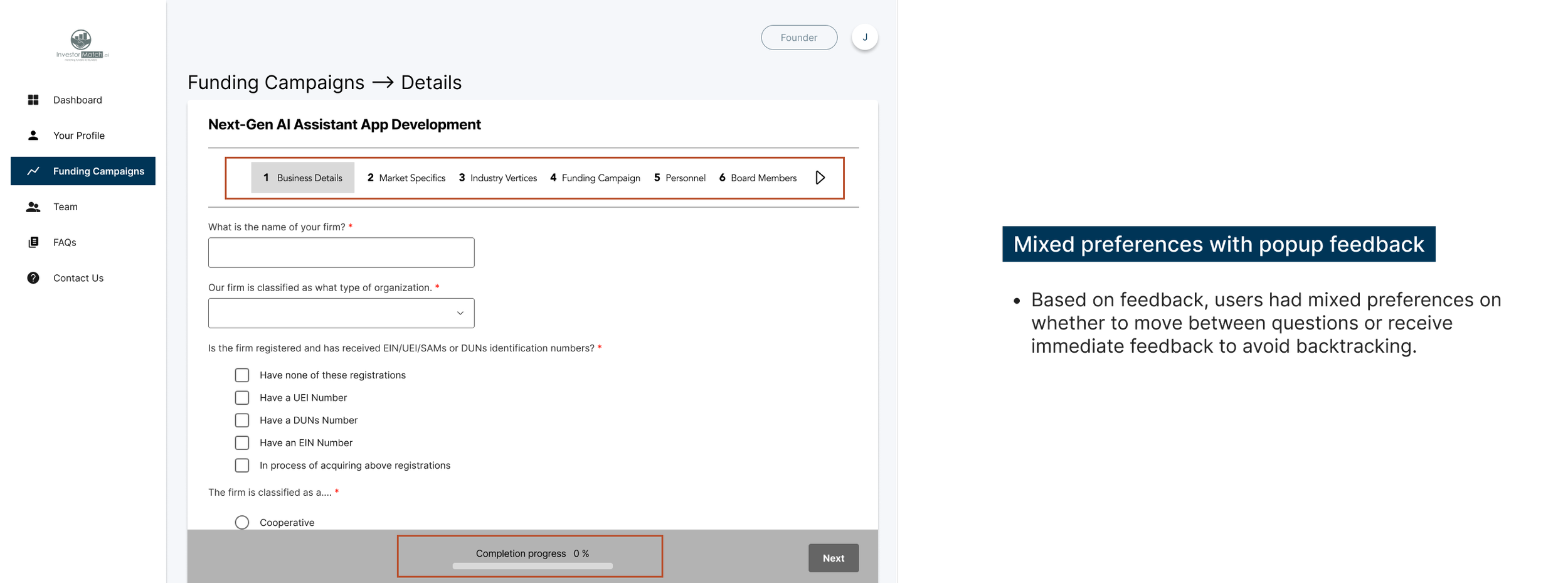
Since the testing involved only two participants, some results were divided, with differing preferences among the participants.
During a prior client meeting, we had a discussion about the timing of pop-up feedback. We went back and forth on the topic for a while, so I suggested that it would be a great opportunity to test with users and see what their preference is. In addition, we aim to validate our proposed flow for onboarding new users and gather feedback from users on the redesign of the fundraising campaign screen.
A deck was created to present to Alan of our findings. Some of our findings can be seen below.
PROPOSED FINAL SCREENS
Proposed Final Screens
After conducting usability tests, we suggested new design solutions to solve for the feedback received from our participants. Some of our solutions were implemented by our client.
ENDING REFLECTIONS
I’ve learned…
Inquiring about previous solutions can save time. During our brainstorming session to address the issues our client shared with us, we proposed some solutions that had already been attempted by our client. If we had asked about the previously attempted solutions that were unsuccessful, we could have saved time and moved on to exploring new ideas earlier.
Don’t tell them. Show them. During our presentation of the product's heuristic evaluation recommendations, our client had difficulty grasping the proposed idea and requested a visual aid for better comprehension. This experience taught me that people tend to be visual learners, and presenting ideas with visuals can aid in understanding.
Main challenges were…
Scheduling conflicts. Finding time alignment with the design team and our client was somewhat difficult due to the time difference and our other responsibilities. However, we effectively navigated this challenge by maintaining clear communication and using communication channels that allowed us to chat quickly. Additionally, I took on several tasks to help move the project forward, recognizing the challenge at hand.
Recruitment of participants. We had hoped to use our client's network to find participants for our interview, but we were unable to gather enough. I quickly realized this problem and sent out a screener survey to my own network. As a result, we were successful in recruiting one more participant for our study.
If I had more time…
Conduct investor interviews. I would like to conduct interviews with investors to identify the key information they require to make an investment decision and determine how we can streamline the process of finding suitable investment opportunities for them. In turn, this can help founders feel less overwhelmed by the extensive information and create a positive experience for both investors and founders.
More Case Studies
How streamlining the skincare product comparison process can increase conversion rate.
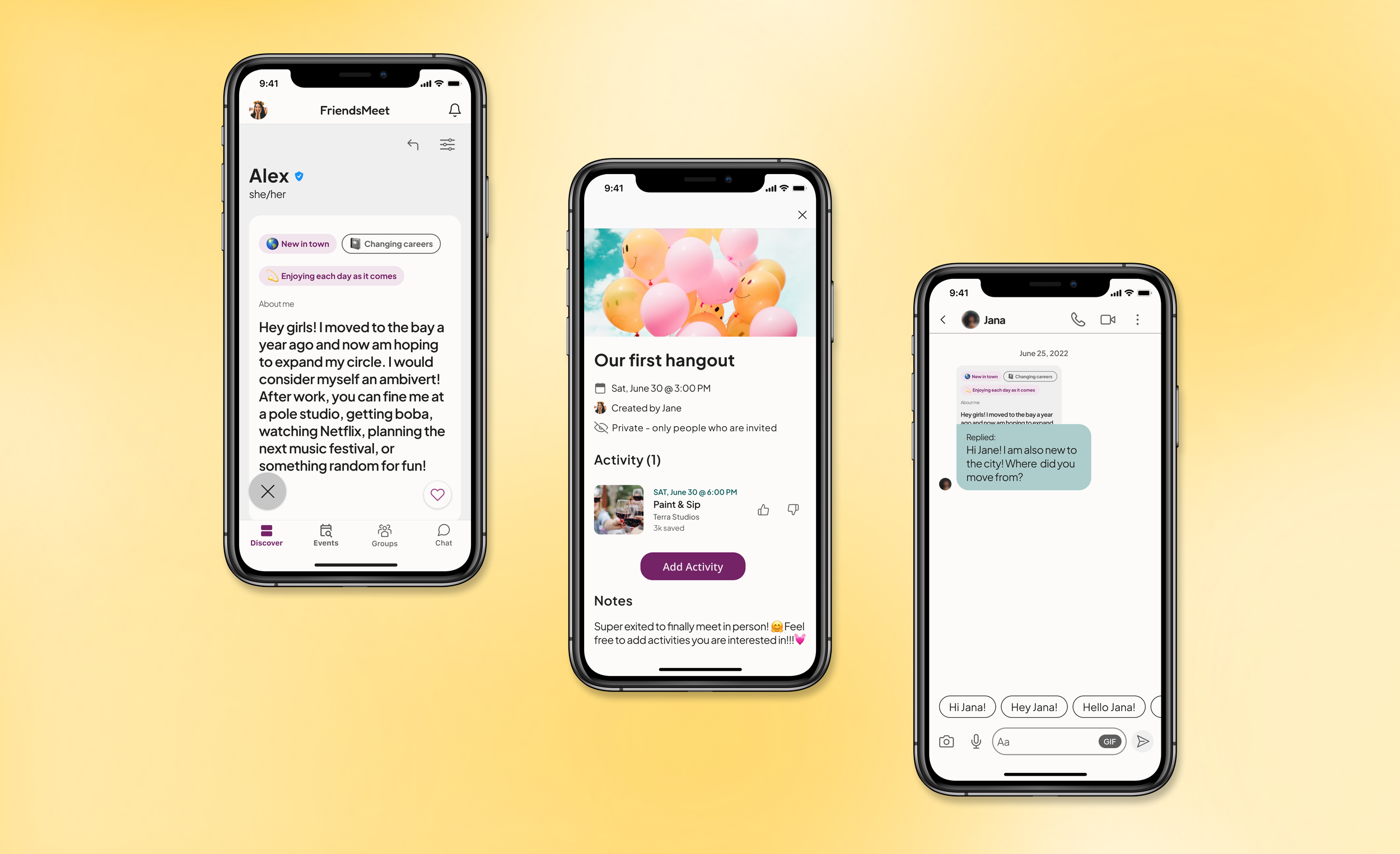
Redesigning the way people forge online connections to turn into meaningful in-person meetups.


